Color Combinations (Color Palettes, Schemes, & Ideas)
Explore 30+ eye-catching color combinations and palettes from nature to help inspire your next design. Color schemes can make your design come alive, set a mood, or create dynamic impact. Select from professional, natural, refreshing, crisp, warm, trendy, and traditional color palettes. For more color combinations see our color palette generator and color schemes.
Color combinations and palettes play a pivotal role in design, offering a visual language that communicates emotions, themes, and aesthetics. A carefully curated color palette can elevate a design, whether it’s through the harmonious blending of tones for a soothing effect or the strategic use of contrasting hues for a bold and dynamic impact.
Color Palettes (Trendy Color Combinations)
1. Fresh and Bright
#FF5588
#DD88CC
#778833
#BBBB55
This blend of vibrant green and pink hues will add an eye-catching element to your design. These lively colors are ideal for creating a poster for a spring or summer event or an advertisement aiming to convey a rejuvenating and youthful atmosphere.
2. Professional & Subdued
#335577
#55AADD
#99CCFF
#DD8844
This blend of colors provides a balance, featuring subtly muted tones that avoid being too dominant. The inclusion of desert clay injects an additional pop of color into the restrained blues, maintaining a professional appearance.
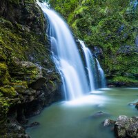
3. Blue Greens
#3377DD
#55AAFF
#339933
#117722
This sophisticated blend of blues and watery greens exudes a subtle charm. A great choice for any brand aiming to showcase its commitment to eco-friendliness.
4. Professional & Traditional
#DD9933
#DDCCBB
#AA6633
#884433
The warmth and eye-catching nature of this palette makes it attention-grabbing and also capable of providing a supportive backdrop for a black and white design.
5. Dark and earthy
#AA5544
#BB6644
#BBBBBB
#555577
The intricate hues of browns and gray found in desert landscapes are mirrored in this color palette. Experiment with a subdued yet surprising mix by opting for plum and reddish oranges.
6. Crisp and dramatic
#77AADD
#AADDFF
#668877
#445511
This color scheme draws inspiration from its dramatic elements. The warm blue colors harmonize seamlessly with the cooler greens.
7. Cool blues
#004477
#007788
#99BBBB
#66AAAA
This color scheme consists of various shades of blue. Given the exceptional versatility of a color like blue, this combination of colors can be applied in a wide range of contexts.
8. Outdoorsy & Natural
#667744
#555500
#DDCC77
#886644
If you own a brand or require a design that highlights natural or eco-friendly characteristics, opting for greens and browns makes perfect sense. This color pairing adds vibrancy by incorporating a touch of green for emphasis.
9. Trendy & Metropolitan
#DDCCBB
#775544
#AA8866
#221111
A golden-brown color serves as the accent, complementing the subtler browns in this palette. This color combination is versatile, suitable for more formal contexts while adding an inviting and bright element to your design.
10. Vibrant Twist
#FFBB00
#554477
#FF5500
#772211
Vibrant hues possess an unquestionable ability to capture attention. This combination of primary colors is subtly toned down, creating a palette with a muted sunset effect.
Best Color Combinations (Schemes & Inspiring Ideas)
11. Refreshing & Pretty
#CC88DD
#EECCFF
#55BBCC
#44DDDD
Fresh turquoise tones complement vivid bubblegum pink, forming a color palette reminiscent of Easter candy. The pink and aqua shades create a clean combination.
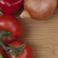
12. Warm & Rustic
#AA0000
#BB8877
#AA7755
#AA5544
This color scheme featuring a gentle brown combined with vibrant warm hues is visually striking. Allowing the neutral tones to take the lead in your design will result in the red tomato and onion serving as ideal accent colors.
13. Playful Greens & Blues
#005588
#3399BB
#667700
#888800
The bluish tones of this assortment feature underlying gray undertones. This subtle muting renders them nearly neutral, providing an excellent base for experimenting with bolder shades such as green.
14. Fresh & Energetic
#66BBEE
#AADDFF
#777733
#BB8855
The blue and green tones bring equilibrium to the more subdued colors, infusing a vibrant freshness that adds a lively kick to the color combination. This type of scheme could be particularly effective for a fitness brand or any design seeking to strike a balance between a professional demeanor and an energetic vibe.
15. Surf & Turf
#77BBFF
#88CCFF
#DD9955
#AA4422
In this seascape of water and rocks, you’ll find a mix of warm and cool colors in both vibrant and muted tones. The tranquil and beach-inspired color palette evokes the essence of a laid-back island getaway.
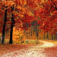
16. Autumn in Tennessee
#FFCC88
#FF8822
#BB5511
#880404
These natural tones exude a rustic charm, reminiscent of the earthy hues found in a woodland autumn setting. This color palette is ideal for those seeking to infuse their brand with a rugged or grounded aesthetic.
17. Icy Blues & Grays
#667799
#99BBDD
#CCCCDD
#999999
Create a dynamic color pairing by combining warm grays with cool, glacial blues. While blue and gray can be a subtle blend, the icy brilliance of the blue in this context adds a burst of visual energy.
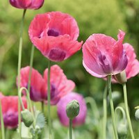
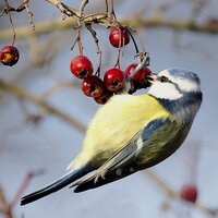
18. Birds and Berries
#99AABB
#EEEEAA
#DDCC88
#AA0303
This blend of colors evokes the initial moments of spring, with thoughts of newly blossoming flowers, budding plants, and fresh berries.
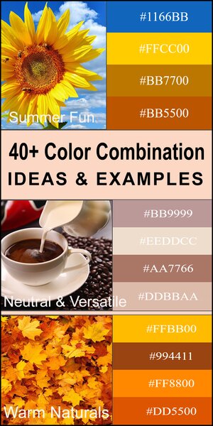
19. Sunflower on a sunny day.
#1166BB
#FFCC00
#BB7700
#BB5500
This color pairing exemplifies the impactful use of contrast. The vivid and bold shades of yellow and orange find equilibrium resulting in a powerful overall effect.
20. Stylish & Retro
#DDBB44
#442200
#887733
#BBAA77
The subdued tones within this color blend create a vintage essence during the 1960s and ’70s. These colors have experienced a revival in popularity in recent years, aligning with the resurgence of mid-century modern design style.
Eye-catching Color Schemes (Popular Color Pairings)
21. Shades of Citrus
#DD3344
#AABB66
#DD8800
#BB5500
Vibrancy is unmistakably conveyed through this diverse array of citrus tones. Opting for orange, pink, and lime green is the ideal choice when seeking a color combination that signifies freshness and vitality.
22. Sunset to Dusk
#554477
#FFAA55
#FF5533
#FF9988
The hues observed in the sky during the transition from sunset to twilight encompass a broad spectrum of peach and orange colors. This combination of colors forms a gentle and refined palette that adds a unique touch to any design.
23. Bright & Tropical
#BB0066
#FF77BB
#88BBDD
#557722
Immerse yourself in a tropical color blend that practically transports you to the warmth of a gentle breeze on your skin. These vibrant, warm hues will infuse your next design with youthful energy and vitality.
24. Warm Naturals
#FFBB00
#994411
#FF8800
#DD5500
Imagine the transition of leaves and the diverse palette of brown, yellow, and orange in the foliage. Employ this color blend to craft a design that is inviting and exudes a sense of coziness.
25. Bold Berries
#668866
#99BB66
#BB1100
#880000
Harmonize vibrant red with gentle green in this color combination. Utilize this blend to design vibrant and playful visuals, where the fresh, natural tones maintain a soothing undertone.
26. Neutral & Versatile
#BB9999
#EEDDCC
#AA7766
#DDBBAA
This neutral color pairing of brown and the color of coffee can complement a wide range of elements. Emphasizing the color of coffee can yield an upscale and sophisticated effect. Alternatively, leaning more towards the brown can evoke a calming and comfortable ambiance, akin to a neighborhood coffee shop.
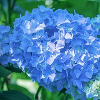
27. Berry Blues
#224466
#336699
#6699CC
#99CCFF
A successful color pairing of highly contrasting blue hues. The various tones of blue are harmoniously blended, evoking the sense of trust that is commonly associated with the color blue.
28. Fun & Tropical
#DDAA55
#FFDDAA
#AA6600
#AA3311
This cheerful mix of colors maintains a lighthearted vibe. Ideal for summer promotions or children’s designs. This color blend creates a playful and enjoyable combination.
29. Fresh Greens
#224400
#447700
#99BB44
#BBDD88
The monochromatic blend of green colors creates a striking contrast. The softer pastel green along with the deeper greens will impart a dynamic effect to your designs.
30. Summer Fiesta
#888833
#BB9922
#AA3322
#552211
Deliciously nostalgic, this combination creates a sophisticated harmonious color blend.
Complementary Color Trends (Creative Color Combinations)
31. Warm & Cool
#DD0022
#880011
#FFDDBB
#BB8866
This palette blends warm and cool tones together to create a distinct combination of colors. To create a softer overall effect, consider tempering each color by adding a touch of white tint.
32. Hazy Grays
#DDDDDD
#777777
#555577
#99AABB
A serene and subtle color combination emerges with a gradient of hazy grayish-blue. This color combination is great to communicate important news, events, updates, or other relevant information.
33. Classy & Timeless
#99BBDD
#775555
#DD4422
#550000
This classic pairing of colors transcends time. Infuse a touch of elegance into your design by employing this harmonious blend of colors. For an added touch of sophistication, consider incorporating gold foil accents in your printed design.
34. Bold & Basic
#FF2288
#BB22BB
#FF8800
#DD4411
This color combination adds an element of unpredictability and excitement to the mix. If you seek a vibrant color scheme that delivers a powerful and attention-grabbing statement in your design, this combination is effortlessly applicable.
In the ever-changing realm of design, staying attuned to the latest color trends is paramount. Design enthusiasts and professionals alike seek inspiration from trendy color palettes and eye-catching color schemes that not only captivate attention but also convey a sense of modernity. From popular color pairings to complementary color trends, the quest for stylish color mixes is unending. Creative minds explore unique color blends, always on the lookout for modern color duos that push the boundaries of convention. Best color combinations are those that strike a delicate balance—harmonious color combinations that harmonize hues in a way that resonates with current aesthetics. Whether opting for bold color contrasts or classic color combinations, the key is to weave together effective color matching and perfect color combinations that not only adhere to seasonal color trends but also consider the principles of color psychology in design. The result is a tapestry of balanced color palettes, each telling a visual story through attractive color harmonies.
In the design landscape, the evolution of color choices is a testament to the dynamic nature of creativity. Designers draw color palette inspiration from a myriad of sources, curating harmonious color combinations. As they delve into the realm of stylish color mixes, the interplay between unique color blends and modern color duos becomes a canvas for expression. The quest for the best color combinations extends beyond the superficial, delving into the intricacies of effective color matching and the creation of balanced color palettes. From bold color contrasts that make a statement to classic color combinations that withstand the test of time, designers navigate the vast spectrum of possibilities. Seasonal color trends offer a timely guide, shaping the narrative of creative endeavors. Ultimately, in the world of design, the pursuit of perfect color combinations remains an ever-unfolding journey, where the artistry lies in harmonizing hues to create visually arresting and timeless compositions.
")